
A couple of months ago, Firefox introduced its new, “improved” UI for the addon manager. I first learned of it here when people began to post about how to get the old one back, and my reply was to expect the new one to become mandatory soon enough, in typical Mozilla fashion.
I wish I had been wrong. I don’t use Firefox proper, with Waterfox (now “Waterfox Classic”) being IMO the only really decent (currently updated) browser in existence, but I saw the hoopla over the “dark theme as default” with the newly released FF 70, and I decided to take a look. As a part of that, I wanted to check and see what effect my chosen FF theme had.
Well, I got sidetracked. I never did get around to trying out the default theme, as the abomination of the new, “improved” addon UI caught my attention. Of course, I have the pref set to banish the new, “improved” one, but it no longer works.
This is desktop Firefox, mind you, not mobile. Here’s the old display, screenshotted at 100% zoom, the default setting:
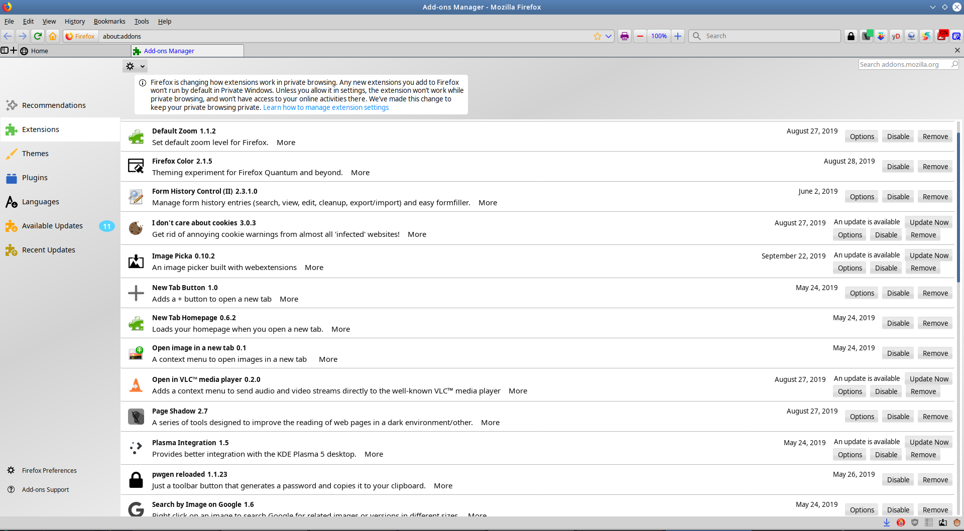
Note that the date of the last change and whether an addon has an update available are clearly visible. The means to remove, disable, or change the settings of an addon are right there and visible, making managing them easy.
Now here’s what Mozilla thinks is an improvement:

What?? Why is it so small? Are they aware that people generally use desktop PC monitors in landscape mode? They’re called widescreen, not tallscreen!
Note the total lack of information there. The “an update is available” notice has been replaced by a blue dot, and the update now, disable, remove, and change settings buttons have all been hidden beneath the much-hated (and deservedly so) hamburger button. Why?
It now takes more clicks to manage addons, no matter what you wanted to do with them. The date of last change is gone, and that stupid blue dot doesn’t exactly scream “update available” the way that actual text saying “an update is available” did. This new UI is less ergonomic, the options less discoverable, and conveys less information while only using half the screenspace it has available.
This is a mobile UI grafted onto a desktop program. The hamburger menu has been studied and found to be a terrible idea, even on mobile devices, where it has been used as a mechanism to get UI out of the way to save space on the tiny little screens those things have to cope with. I have a 23 inch widescreen display, though, so why am I being given a UI designed for a mobile phone, and even then suboptimally?
This is just one more of a long, LONG series of UI missteps by Mozilla. UI wise, Firefox has been getting worse and worse for years, but we used to have a way of fixing every one of the many mistakes Mozilla made (by use of the Classic addons, of course). Now they’ve removed that ability in what I consider to be the mistake of all mistakes, and that means their new mistakes can’t be fixed at all.
Waterfox and Pale Moon remain the only browsers on desktop I’ve tried that retain or permit a UI optimized for desktops and that accept the full range of addons necessary to twist and bend the web to fit the user’s preferences. Ever since Chrome came along and standardized the hamburger menu on browsers, Mozilla has been following suit, with two different attempts at a UI that looks like Chrome (tabs up on top) rather than Firefox (which had always put the tabs right above the content, below the URL bar, until Mozilla began their quest to try to become Chrome). Pale Moon has the best UI out of the box, by my way of thinking, but Waterfox’s UI can be fully reverted to be just as good as Pale Moon’s, while retaining Waterfox’s silky smooth scrolling and ability to use most current Firefox addons as well as well as Classic addons.
I just worry about how long Waterfox will be possible as the Mozilla base from which its security updates are pulled continues to diverge from v56, from whence Waterfox came.
Dell XPS 13/9310, i5-1135G7/16GB, KDE Neon 6.2
XPG Xenia 15, i7-9750H/32GB & GTX1660ti, Kubuntu 24.04
Acer Swift Go 14, i5-1335U/16GB, Kubuntu 24.04 (and Win 11)


