• Sneak peak – testing out a new skin on the forum

    Home » Forums » Newsletter and Homepage topics » Sneak peak – testing out a new skin on the forum

    Author
    Topic
    #2391652

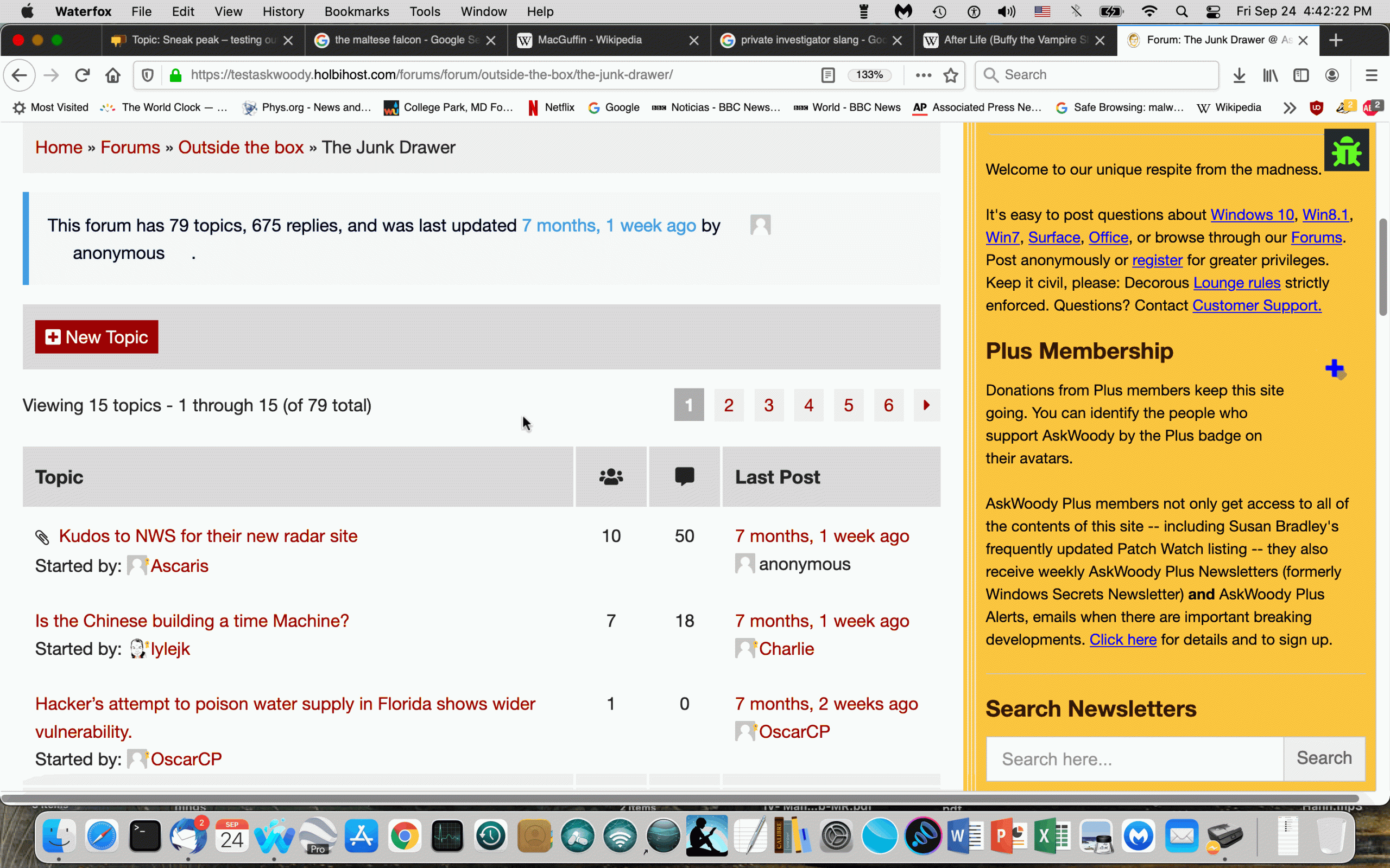
    Over on a test forum (where we turn it on when we want to test updates and new plug ins) I have a test going on a new “skin” for the forum. Note we’re
    [See the full post at: Sneak peak – testing out a new skin on the forum]

    Susan Bradley Patch Lady/Prudent patcher

    1 user thanked author for this post.
    Viewing 20 reply threads
    Author
    Replies
    • #2391663

      Testing anything new here in the “Test” Forum first? Wise move. So far, the new look of the Forums section seems OK to me, except some forums’ thread lists might not be quite up to date (see below).

      And as long as achieving this better look does not break something else … For more reference: “Magic has consequences, it always has!” (Spike to Xander, when learning that the gang has brought Buffy back to life by all joining in the making of a spell conducted by Willow, in Buffy TVS, Season 6, episode 3.)

      Screen-Shot-2021-09-24-at-4.42.22-PM

      Ex-Windows user (Win. 98, XP, 7); since mid-2017 using also macOS. Presently on Monterey 12.15 & sometimes running also Linux (Mint).

      MacBook Pro circa mid-2015, 15" display, with 16GB 1600 GHz DDR3 RAM, 1 TB SSD, a Haswell architecture Intel CPU with 4 Cores and 8 Threads model i7-4870HQ @ 2.50GHz.
      Intel Iris Pro GPU with Built-in Bus, VRAM 1.5 GB, Display 2880 x 1800 Retina, 24-Bit color.
      macOS Monterey; browsers: Waterfox "Current", Vivaldi and (now and then) Chrome; security apps. Intego AV

      • #2391691

        This is a database of the site as it was months ago.  So the threads in there are quite old.  Most of the time the testbed site it turned off, but we turn it on to test major patches/updates/redesigns before rolling them out on the main site.

        Susan Bradley Patch Lady/Prudent patcher

        4 users thanked author for this post.
    • #2391749

      The red lettering on white background looks good and contrasts nicely with the yellow/blue surrounding. Win 7 Thinkpad.

      • #2391795

        Don’t get to used to that , I’m going to change it to traditional “blue” of unvisited links. 🙂

        Susan Bradley Patch Lady/Prudent patcher

        2 users thanked author for this post.
    • #2391758

      The new “skin” looks really good to me – nice and clear and easy to read.

    • #2391762

      On my Pixel 4a screen using Firefox Android the fonts appear smaller and less crisp (contrast?)…and more difficult to read.  Otherwise layout is great.

    • #2391778

      I use only Firefox, the current version or the one before for a few days after a new version is released.

      Overall the new look is clean and functional.

      Personally, of course, I’m not a fan of reddish text for general use and prefer that it be used sparingly. But that’s just me. (I once had a house with a very similar color scheme, predominantly gunmetal grey with maroon doors and shutters.)

      In my browser, on the current AW forums pages, hovering over blue links changes them to red. Visited links are shown as purplish (without hovering).

      On the test AW forums pages, hovering over links triggers the underline but the color stays the same reddish color. Visited links don’t seem to show any indication that they have been visited (although the visited case just may not have been addressed yet).

      Oh – You almost had me setting aside time to update our PCs this weekend when I saw the “4” all clear MS-DEFCON at the top of the test forums page. 🙂

      • #2391786

        Visited links don’t seem to show any indication that they have been visited

        Great point. That needs to be fixed.

        • #2391796

          On the list to be changed to traditional blue.  Hang loose (see why we do testing 🙂

          Susan Bradley Patch Lady/Prudent patcher

          2 users thanked author for this post.
      • #2391802

        @opt1 said above in post #2391778:

        Oh – You almost had me setting aside time to update our PCs this weekend when I saw the “4” all clear MS-DEFCON at the top of the test forums page.

        This still exists as of this writing. Any real way to fix the image so it doesn’t mistakenly dupe a user into updating too early and inadvertently becoming one of the “canaries”?

        If @opt1 nearly fell for it, there might be a few others who might fall for it before they realize that the MS-DEFCON status indicator reflects the status on a certain date that was seven months ago, not today.


        1 user thanked author for this post.
    • #2391781

      I agree with opti 1. as to each of his comments. I’m also a Firefox user and the red lettering you used is very harsh on the eyes. Is there a softer shade of red that you might use that would fit in with your motif? Everything else looks pretty good to me.

      In the end result, it’s the content that counts and brings readers to this site. But, form can’t be ignored. That’s my two cents worth.

      You work so hard on this site Susan that my comment seems trivial. Thanks for all your efforts.

      Peace, CAS


      1 user thanked author for this post.
    • #2391810

      Actually, the whole site needs a refresh.

      Looks like the mid-1990’s.


    • #2391815

      I’ve notice that the “New Posts” bubble is gone. Any reason for that?

      I like that it doesn’t show up as a link until you hover.

    • #2391819

      On the list to be changed to traditional blue.  Hang loose (see why we do testing 🙂

      What blue? I HATE blue (as it is the harshest color to read). I like most other colors. So, I am grateful that this site lets me change link colors in my default browser (Basilisk), and most other browsers also, to the colors I prefer AND this site HONORS those changes.

      • #2391825

        I am confused by all the talk here of links changing color when used by … a user? Like me?

        What I can see, and have seen, since the shift to blue links, with any of my browsers, is that they stay as blue as cornflower in late spring though mid-summer, or the violets of the fields, no matter how many times I click on them in any short number of hours. What changes is the darkness of the (to me at least) brown name of the topic on the left column, from dark to light brown, of any thread I have recently accessed.

        Ex-Windows user (Win. 98, XP, 7); since mid-2017 using also macOS. Presently on Monterey 12.15 & sometimes running also Linux (Mint).

        MacBook Pro circa mid-2015, 15" display, with 16GB 1600 GHz DDR3 RAM, 1 TB SSD, a Haswell architecture Intel CPU with 4 Cores and 8 Threads model i7-4870HQ @ 2.50GHz.
        Intel Iris Pro GPU with Built-in Bus, VRAM 1.5 GB, Display 2880 x 1800 Retina, 24-Bit color.
        macOS Monterey; browsers: Waterfox "Current", Vivaldi and (now and then) Chrome; security apps. Intego AV

    • #2391830

      Ugh. On Fx 78.14.0ESR, I see the horrible blue here now for unvisited links. Oddly, Fx 78x honors my VISITED link color but not UNvisited on all my tabbed sites.

      I am seriously considering (after 22 years now of having the internet in my home) of giving up the internet next year when Charter starts charging $100 a month!! just for internet access at base speed. The price just went up two months ago from the several years price of $63.95 to $75 a month. I can barely afford that. I can’t afford $100 a month just for internet next year. Charter is the ONLY broadband provider here (except for a few small areas that have fast dsl).

      I fear that the Pale Moon dev might change link colors in the next Basilisk. I don’t want to have that happen shortly after I make a major purchase next year of a new desktop computer, so I may very well have to access the internet (only when absolutely necessary) on my iPhone 10r) and not purchase a new computer next year.

      Edit: I might be able to use Stylus to change the unvisited link color in Fx 78 but I don’t know how to write the style.

    • #2391843

      It is definitely clear that some of us are not seeing the same things in the new pages, or in the old ones, for that matter, at all (see my comment on what I see, and not see, further up.)

      This is profoundly weird. And is not new.
      And my color vision is fine. As proof of this, I just took and passed, again, with a score of 100% the Standard Ishihara Test:

      https://colormax.org/color-blind-test/

      (My browsers are listed below, in my signature panel.)

      Ex-Windows user (Win. 98, XP, 7); since mid-2017 using also macOS. Presently on Monterey 12.15 & sometimes running also Linux (Mint).

      MacBook Pro circa mid-2015, 15" display, with 16GB 1600 GHz DDR3 RAM, 1 TB SSD, a Haswell architecture Intel CPU with 4 Cores and 8 Threads model i7-4870HQ @ 2.50GHz.
      Intel Iris Pro GPU with Built-in Bus, VRAM 1.5 GB, Display 2880 x 1800 Retina, 24-Bit color.
      macOS Monterey; browsers: Waterfox "Current", Vivaldi and (now and then) Chrome; security apps. Intego AV

    • #2391858

      What changes is the darkness of the (to me at least) brown name of the topic on the left column, from dark to light brown, of any thread I have recently accessed.

      It is definitely clear that some of us are not seeing the same things in the new pages, or in the old ones, for that matter, at all

      I meant to ask you earlier what “brown” name of the topic on the left column? The name of the thread topic is not on the left column but ACROSS the page at the top. It is in Black BOLDED FONT. It’s always been this way since I joined here (and I have not tried to alter its look). I have an Apple watch and iPhone but my computers are still (and always have been) Dell XPS (and its predecessor) ones and a Dell Ultra Sharp 24″ widescreen monitor since 2013. So, maybe what you describe is a Mac thing?

      As for link colors, you had versions of Windows that allowed you to change default Windows link colors to whatever you wanted but Microsoft warns that the colors YOU choose may not be honored if you are not ALSO using Microsoft high contrast themes. I have had Dell computers since 1999 and Windows 98 and have ALWAYS been able to change link colors in Mozilla Suite, then Firebird, then Firefox and some other browsers WITHOUT needing to use a Microsoft ugly, garish looking, high contrast theme. I have run into only a handful of sites through out all these years that did not honor my link colors even though I have never used a Microsoft high contrast theme.

      Recently though I have been seeing more sites NOT honor my link colors. I have not tried to change my theme to a Microsoft high contrast one to see if then the link colors would be honored. The high contrast themes are extremely garish…just like the bright garish blue link used here by default if you don’t change it in your browser. Interestingly though, IE never honored my link color changes but Edge does! In fact, Edge is turning into a very decent browser to my surprise. (I’m still a Mozilla person though and my default browser Basilisk is forked off Fx 52 ESR and it is the best browser I’ve ever used).

      I suspect some of these differences in how this website looks to different users may be due to video card settings. I’ve always had nVidia cards (except for my first computer) and I set digital vibrance to about 60%. That definitely affects colors. My first computer with Windows 98 came with an ATI Radeon card and a Sony Trinitron monitor. Being new to computers, I didn’t attempt to change anything regarding link colors. The next computer though I knew I wanted an nVidia card (same Trinitron monitor). The difference in the colors PARTICULARLY RED AND SHADES THEREOF between the two video cards using the same monitor and a newer Dell Dimension XPS computer three years after I got my first computer was astounding. (I don’t think moving to XP Pro from 98SE on the second computer had anything to do with how different red in particular was between the two computers one with an ATI Radeon card and one with an nVidia card. The RED SHADES were far more vibrant with the nVidia card and playing with the setting for digital vibrance that came on the nVidia card but not the ATI Radeon (it may have a similar setting now, I don’t know) made colors especially rich and vibrant but not garish with the one exception of the Microsoft default unvisited link color which was always an extremely garish bright neon like blue that is extremely harsh and makes my eyes water, burn and sting quickly.

      So, I think a lot of the color differences we see and feel sort of puzzled because others see the colors differently is due to the video card we have (and the Intel one that comes with most Windows computers these days is very weak on colors) and then the ATI Radeon one is different from the geForce Nvidia one and then all the changes one can make in how colors display with these cards…well, no wonder we don’t see the same things even though we may be on the same site.

      1 user thanked author for this post.
    • #2391877

      Mele20: Actually, now that you mentioned it and I have had a good look in a long time to this, it is not really very dark brown but black lettering and the other is grey lettering on the LEFT column. And the links I have recently used are still blue, exactly the same blue as the rest of the links, used already or not.
      I have not done anything to set the colors, I have never done that. They do not matter to me, at all, as long as they are different in the LEFT and the right columns.

      See below:

      Example

      Ex-Windows user (Win. 98, XP, 7); since mid-2017 using also macOS. Presently on Monterey 12.15 & sometimes running also Linux (Mint).

      MacBook Pro circa mid-2015, 15" display, with 16GB 1600 GHz DDR3 RAM, 1 TB SSD, a Haswell architecture Intel CPU with 4 Cores and 8 Threads model i7-4870HQ @ 2.50GHz.
      Intel Iris Pro GPU with Built-in Bus, VRAM 1.5 GB, Display 2880 x 1800 Retina, 24-Bit color.
      macOS Monterey; browsers: Waterfox "Current", Vivaldi and (now and then) Chrome; security apps. Intego AV

      • #2391881

        Did you use the “Back” button to return to that screen. If so, perhaps it shows you the “before” as it was, not the “after” you looked at it.

        • #2391892

          PK: No, I just went away and then came back.

          Ex-Windows user (Win. 98, XP, 7); since mid-2017 using also macOS. Presently on Monterey 12.15 & sometimes running also Linux (Mint).

          MacBook Pro circa mid-2015, 15" display, with 16GB 1600 GHz DDR3 RAM, 1 TB SSD, a Haswell architecture Intel CPU with 4 Cores and 8 Threads model i7-4870HQ @ 2.50GHz.
          Intel Iris Pro GPU with Built-in Bus, VRAM 1.5 GB, Display 2880 x 1800 Retina, 24-Bit color.
          macOS Monterey; browsers: Waterfox "Current", Vivaldi and (now and then) Chrome; security apps. Intego AV

    • #2391886

      One should remember that there are browser settings to visited link colors. BTW Is this thread in the NEW mode? When I first looked at the test site every thing looked BIGGER. I am not seeing it here.
      May we inquire what were you trying to change, so we may comment on that??

      🍻

      Just because you don't know where you are going doesn't mean any road will get you there.
      • #2391895

        OK, so is then everybody else here setting the browsers to show links in their favorite colors, but me?

        I like to be different, so I hope very much the answer is “YES.”

        Ex-Windows user (Win. 98, XP, 7); since mid-2017 using also macOS. Presently on Monterey 12.15 & sometimes running also Linux (Mint).

        MacBook Pro circa mid-2015, 15" display, with 16GB 1600 GHz DDR3 RAM, 1 TB SSD, a Haswell architecture Intel CPU with 4 Cores and 8 Threads model i7-4870HQ @ 2.50GHz.
        Intel Iris Pro GPU with Built-in Bus, VRAM 1.5 GB, Display 2880 x 1800 Retina, 24-Bit color.
        macOS Monterey; browsers: Waterfox "Current", Vivaldi and (now and then) Chrome; security apps. Intego AV

      • #2391901

        No this main site is still on the old skin.

        You have to go over here https://testaskwoody.holbihost.com/forums/ to see the new skin.

        We haven’t yet fixed the colors, or the anon needs to put anon in as their name/email address in order to post on the test site.  More testing will come next week.


        Susan Bradley Patch Lady/Prudent patcher

        • #2391914

          Susan, I was not referring to the test skin only, but to what people are saying about links changing colors everywhere. For example in the “Recent replies: Last three days”, where I took the snapshot I attached to my previous comment, that shows not such a change having taken place after clicking a link there and visiting the thread, then coming back to “Recent replies” via the Home page and not by hitting the “Back”button  in the browser.

          In fact, until this conversation, I thought that the way I saw the links was the way everyone saw them. Until now I find out it is not.

          Ex-Windows user (Win. 98, XP, 7); since mid-2017 using also macOS. Presently on Monterey 12.15 & sometimes running also Linux (Mint).

          MacBook Pro circa mid-2015, 15" display, with 16GB 1600 GHz DDR3 RAM, 1 TB SSD, a Haswell architecture Intel CPU with 4 Cores and 8 Threads model i7-4870HQ @ 2.50GHz.
          Intel Iris Pro GPU with Built-in Bus, VRAM 1.5 GB, Display 2880 x 1800 Retina, 24-Bit color.
          macOS Monterey; browsers: Waterfox "Current", Vivaldi and (now and then) Chrome; security apps. Intego AV

      • #2391903

        Topic: Test post @ AskWoody (holbihost.com)

        Go there and do a test reply.  It should be bigger in size and most importantly have the easier “new reply” in the top box which will immediately get you to the place you need to post.  Colors are still red, don’t get used to them they are going to change to the “traditional” followed/unfollowed like the main site. (and to answer Oscar’s question, I’ve never changed the default colors either)

        Susan Bradley Patch Lady/Prudent patcher

    • #2391930

      In fact, until this conversation, I thought that the way I saw the links was the way everyone saw them. Until now I find out it is not.

      OscarCP – Lol. You should trademark that phrase. I know it could apply to many things I have encountered in life, especially as I enter the so called ‘golden years’ where it seems nothing is as it was even just a few years ago.

      Hang in there.  🙂

      3 users thanked author for this post.
    • #2392006

      At least as I understand it, Susan has described how the links will appear with the new look she is testing. The unused ones are going to be blue, those already used, red.

      That is all good and well, except that we, as it turned out, don’t see things the same way, not just the way Susan says, but not even the way some us as say and, therefore, any discussion of “blue and red” is moot and, if so, it is also a waste of time, as there is no red and blue that we can express opinions about, but a whole palette of different colors that we do not even experience as a group here.

      It is as if there was an astronomer’s convention, where (to simplify the analogy) two sessions took place in different rooms at the same time, but the convention’s technical program only says in each there is going to be a discussion of what the Moon is made of, not what each session is going to be exactly about on this general topic. And, as it turns out, one group of astronomers is discussing, in one room, based on what they believe is the common and accepted knowledge everywhere that it is made of cheese, of what kind of cheese is the Moon made of. And in the next room, another bunch of astronomer are discussing, based on the commonly accepted fact everywhere that it is made of some very old rocks, of what kind of rocks is the Moon made of. And the ones at the “cheese” session do not know about the “rock” session or have even heard of any generally accepted “rock” idea, nor do those at the rock session know about the cheese one, or of some general consensus that it is made of cheese. Although their sessions are taking place in adjacent rooms. Until, by chance, one of the cheese people runs, during the coffee break, into a group of the stone people. And, as a result of the ensuing conversation, some among them start to wonder what are they supposed to be doing at this convention, and, more importantly, why are they there at all.

      Ex-Windows user (Win. 98, XP, 7); since mid-2017 using also macOS. Presently on Monterey 12.15 & sometimes running also Linux (Mint).

      MacBook Pro circa mid-2015, 15" display, with 16GB 1600 GHz DDR3 RAM, 1 TB SSD, a Haswell architecture Intel CPU with 4 Cores and 8 Threads model i7-4870HQ @ 2.50GHz.
      Intel Iris Pro GPU with Built-in Bus, VRAM 1.5 GB, Display 2880 x 1800 Retina, 24-Bit color.
      macOS Monterey; browsers: Waterfox "Current", Vivaldi and (now and then) Chrome; security apps. Intego AV

    • #2392162

      https://testaskwoody.holbihost.com/forums/

      Okay take a look at the colors now please?

      Susan Bradley Patch Lady/Prudent patcher

      • #2392166

        It all looks nice and blue. I click on a link, it stays blue. Even after I refresh the page. I am not sure how the various “Test” pages are supposed to be used. I am no longer a spry, quick on the uptake seventy-year old, you know? Need time to catch up and some times need help crossing the street. Not many boy scouts around anymore, these days, that I’ve noticed.

        Ex-Windows user (Win. 98, XP, 7); since mid-2017 using also macOS. Presently on Monterey 12.15 & sometimes running also Linux (Mint).

        MacBook Pro circa mid-2015, 15" display, with 16GB 1600 GHz DDR3 RAM, 1 TB SSD, a Haswell architecture Intel CPU with 4 Cores and 8 Threads model i7-4870HQ @ 2.50GHz.
        Intel Iris Pro GPU with Built-in Bus, VRAM 1.5 GB, Display 2880 x 1800 Retina, 24-Bit color.
        macOS Monterey; browsers: Waterfox "Current", Vivaldi and (now and then) Chrome; security apps. Intego AV

    • #2392270

      https://testaskwoody.holbihost.com/forums/

      Okay take a look at the colors now please?

      If you intend to force such a GARISH look on us….well, I guess I won’t be coming here anymore. Currently, on Basilisk browser your regular site honors MY choice of link colors but your link just now to the new site showed up in horrible neon blue links! Perfect way to cause a migraine headache. 🙁

      • #2392330

        Can you try it again?  We’ve toned the colors down a bit.

        Susan Bradley Patch Lady/Prudent patcher

        • #2392331

          It appears there is still no color difference of unvisited vs. visited links?

    • #2392276

      re: the new blue test pages, they look too blue. It has a cold feel to it. Maybe some more warm tones ?

    • #2392311

      Capture-5

      this how my browser displays, it is set by me and is readable and easy on the eyes. Perhaps you might try these colors.

      BTW the new fonts are a bit too big for my taste.

      Capture-5

      my poor scroll finger will wear out 👆🏻

      🍻

      Just because you don't know where you are going doesn't mean any road will get you there.
      • #2392354

        Wavy: Your posted screenshot may be hiding the difference you are trying to show, at least it does to me, because I don’t see it. At all. Probably this is caused by the screenshot-taking software under your OS hood.

        An effective way to get what you hanker after would be for you to set the “Night view” (or whatever it is called) in the “Accessibility” (or whatever it is called) setup section of your very own computer OS (whichever this may be) from midnight to midnight, so you always get a warmer game of colors by a slight shift to the red, the depth of which might also be, perhaps, who knows, adjustable? (I don’t have Windows 10, or Windows of any kind, anymore, so I have no idea, and am a lot happier this way.)

        Good luck in your quest for monitor color-scheme improvement.

        Ex-Windows user (Win. 98, XP, 7); since mid-2017 using also macOS. Presently on Monterey 12.15 & sometimes running also Linux (Mint).

        MacBook Pro circa mid-2015, 15" display, with 16GB 1600 GHz DDR3 RAM, 1 TB SSD, a Haswell architecture Intel CPU with 4 Cores and 8 Threads model i7-4870HQ @ 2.50GHz.
        Intel Iris Pro GPU with Built-in Bus, VRAM 1.5 GB, Display 2880 x 1800 Retina, 24-Bit color.
        macOS Monterey; browsers: Waterfox "Current", Vivaldi and (now and then) Chrome; security apps. Intego AV

        • #2392393

          Please reread
          What makes you think I do not have what I want in the realm of color?

          🍻

          Just because you don't know where you are going doesn't mean any road will get you there.
          • #2392397

            Wavy, maybe I have heard too much complaining, for my limited and feeble endurance, that is, about “the color” that I automatically, and incorrectly, lumped your comment with those other ones. Apologies.

            By the way, what is the Moon made of?

            Ex-Windows user (Win. 98, XP, 7); since mid-2017 using also macOS. Presently on Monterey 12.15 & sometimes running also Linux (Mint).

            MacBook Pro circa mid-2015, 15" display, with 16GB 1600 GHz DDR3 RAM, 1 TB SSD, a Haswell architecture Intel CPU with 4 Cores and 8 Threads model i7-4870HQ @ 2.50GHz.
            Intel Iris Pro GPU with Built-in Bus, VRAM 1.5 GB, Display 2880 x 1800 Retina, 24-Bit color.
            macOS Monterey; browsers: Waterfox "Current", Vivaldi and (now and then) Chrome; security apps. Intego AV

    • #2598585

      It looks like I’ve been blocked.  I can’t access the link.

      Mark


      • #2598600

        This is a two year old post and the skin is on the main site now.

        Susan Bradley Patch Lady/Prudent patcher

    Viewing 20 reply threads
    Reply To: Sneak peak – testing out a new skin on the forum

    You can use BBCodes to format your content.
    Your account can't use all available BBCodes, they will be stripped before saving.

    Your information: