• *** Simple Muti-Series Line Graph ***

    Author
    Topic
    #490397

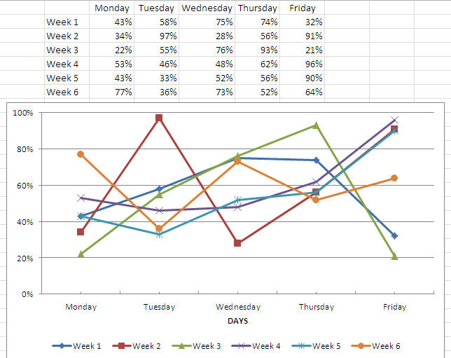
    Goal: produce a line graph with these conditions

    * multiple lines (series) of K

    ** going across the graph using X data (horizontal axis)

    *** by Y (vertical axis)

    i don’t know what to look for. the information out there is a mess, and it’s hard to separate the garbage from the quality, so i really really prefer a link to a guide/article/video. if you could link that, it would be great

    there are many ways to do this, but is the best way?

    excel 2010, win

    Viewing 13 reply threads
    Author
    Replies
    • #1405184

      Could you post an example workbook with some representative data and perhaps (if nothing else) a “drawing” of what the chart should look like.

      Steve

    • #1405188

      i’ll try to do a drawing…

      so basically you have a box
      inside the box you have a line going from left to right
      you have mutiple lines and they can overlap each other so it would look like “insert –> line –> and under 2d line”

      that’s basically it

      so just how do you make a line graph that has mutiple lines

      hope that helps

    • #1405195
    • #1405197

      How is what you’re looking for different from a multi-line graph as created here:

      34602-Clip

    • #1405198

      it’s the same, just how do you do it without this method — “insert –> line –> and under 2d line”

      how do you do it manually (inputting data into those “series” boxes)?

    • #1405200

      I think you’re asking for the legend to be on the bottom?

      34603-Clip2

    • #1405201

      im asking how to create the chart in the first place

      the data is not in the clean format you have

      when you right click on an empty chart, you have to put in data “select data”

      i don’t know how to use this.

      it’s very confusing, and i couldn’t find any guides, they were all about the easy way –> insert, etc.

      i just need to know conceptually what to put where and i can do it

      also there are many ways to do that line graph thing, and i needed to know what would be the most flexible way

    • #1405203

      Creating a chart by its very nature implies that you have data that should populate the chart.

      When you right click and use “select data” you can see that the dialog box is expecting you to select the range of data to be charted.

      You should first build the data in the spreadsheet, select it, and insert a chart of your choice.

      Maybe this will help:

      http://office.microsoft.com/en-us/excel-help/create-a-chart-HP001233728.aspx

    • #1405204

      none is about “select data” — the first part is just about the easy way and the rest is just about presentation. it completely skipped the “select data” part

      the only thing related to “select data” is how to select, but it doesn’t tell you what or where

      any better guides?

    • #1405210

      Are you relatively new to Excel?

      You need to enter the data to be charted, cell-by-cell, in the cells similar to what my last posted pic was.
      Then, drag over those cells (select them) and click on insert, whatever chart you want, and Excel will use that data selection to chart the information.

      If I’m not understanding what you’re saying, please try to clarify.

    • #1405214

      yes im new, in that i haven’t done these kind of things

      though misunderstanding is pretty high. i clearly said that i did not want to do it the easy way — “click on insert, whatever chart you want, and Excel will use that data selection to chart the information” — for the reasons already mentioned

      here are the specifics so you can see what im stuck on:
      after right-clicking on an empty line chart,
      *what am i suppose to put in “chart data range” at the top of the popup?
      *when adding a “series” why does “series Y values” have ={1}? this is so confusing. am i suppose to replace the whole thing, or just replace the {1}, or not just add *whatever after this? very confusing. need a guide.
      *how do i “edit” the “horizontal axis labels”?? it’s blanked out

      i really just need a guide or good links in how to create a chart (manually, which means not the easy way)

    • #1405224

      In chart data range you enter the range of where the data is located. This is the location of the cells containing your x and y data. If you do this the series will be filled in automatically. If you select the data first (before creating the chart) it will fill in automatically as well.

      If you are going to manually fill in a series, just leave chart data range blank, and click on Edit. The series name is the name/description of the series
      Weeek15
      . The series value is an array of values (the Y values). Either enter a range (you can actually enter equal and then select the range) or enter an array of values in squiggly brackets like:
      ={0.15,0.23,#N/A,0.71,0.93,0.43,0.23}

      You can add a new series
      series name:
      =”Week 16″
      Series value:
      ={0.35,0.42,0.18,0.39,0.64,0.1,0.06}

      You would then enter the Horizontal category x axis and enter the array:
      ={“Monday”,”Tuesday”,”Wednesday”,”Thursday”,”Friday”,”Saturday”,”Sunday”}

      I do not recommend the manual method. I would enter the values Monday through Sunday in the cells A2 through A8, then enter “Week 15” in B1 and enter the respective values (0.15, 0.23 ,=na(), 0.71, 0.93, 0.43, and 0.23 into the cells B2 through B8 and enter “Week 16” into C1 and in C2 through C8 enter: 0.35,0.42,0.18,0.39,0.64,0.1, and 0.06 respectively. The format B2:C8 as percentage. Then select A1:C8, press the insert chart, select the first line chart and the chart will be created automatically.

      Steve

    • #1409550

      i finally figured out how to put in the data to get the multiple lines…..

      btw, the post was really really confusing. the post wasn’t very descriptive “range” and i don’t know what ‘location’ means

      if range means A1:A100, then that makes a lot more sense to someone new

      i also don’t understand what ‘array’ means and all of this could’ve been explained much user-friendly

    • #1409563

      I am sorry you found the post confusing. Range and Location and Array, are all normal english words. I could not say something like the range A1:A100 since I had no idea what range of cells your data was in, you did not provide an example workbook to describe in detail, so I had to be general.

      I am not sure how more “user-friendly” the post could have been. Did you try walking through the post step-by-step with the workbook adding what it said to do? I indicated in the post, that I would not recommend the manual method: the automatic method is so much easier. Again, it it tough to walk you through the steps when we do not know how your spreadsheet is setup.

      If you want to find videos of steps, instead of the descriptions you would get here, I would recommend googling. You may also want to take a beginning excel class or purchase a beginners guide to excel.

      Steve

    Viewing 13 reply threads
    Reply To: *** Simple Muti-Series Line Graph ***

    You can use BBCodes to format your content.
    Your account can't use all available BBCodes, they will be stripped before saving.

    Your information: