• Excel 2010: how to force X-axis dates to be categories

    Home » Forums » AskWoody support » Productivity software by function » MS Excel and spreadsheet help » Excel 2010: how to force X-axis dates to be categories

    Author
    Topic
    #478711

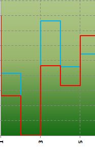
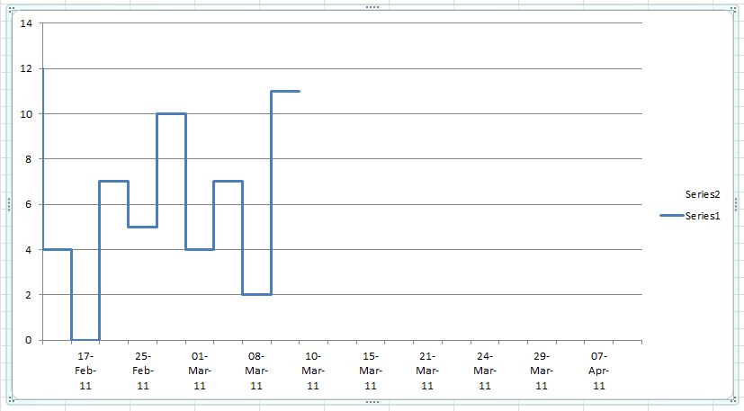
    I have data in Excel that is listed by Date with a value against each date.

    I wish to chart this data so that the Date is forced to be an X-axis “category” rather than a “value”, that is, I want equal spaces between the dates along the x-axis of my chart rather than have the space between my data dates separated by the number of days between the dates.

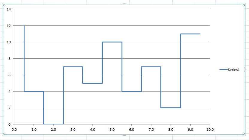
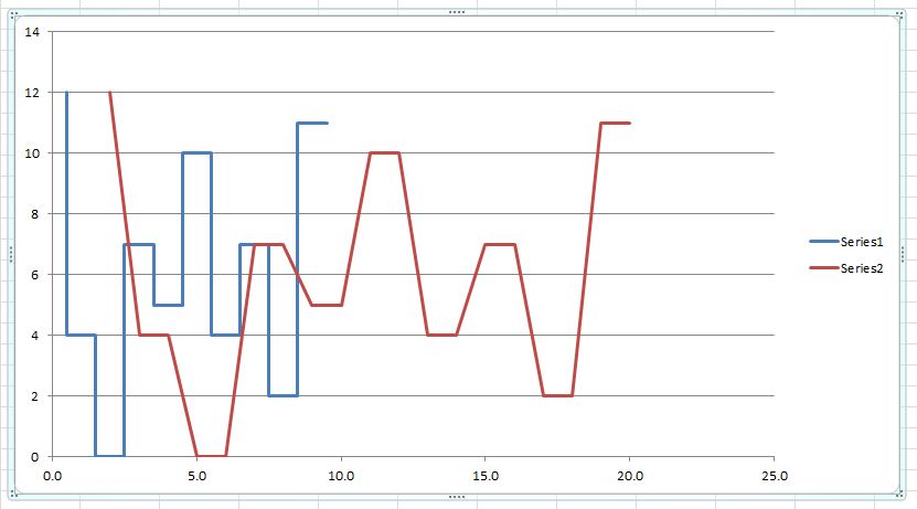
    I’m using a Scatter chart with the X-axis categories selected using named ranges defined by an OFFSET()MATCH() formula and with the Y-axis values named range defined using an OFFSET() formula that references the X-axis named range.

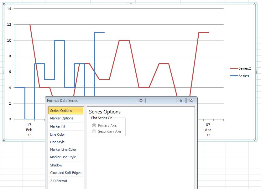
    In the early versions of Excel (ie ,2007) dates for be explicitly defined as values, categories or time values, but I haven’t been able to locate a corresponding command dialogue in Excel 2010.

    Any clues will be much appreciated.

    Cheers

    BygAuldByrd

    Viewing 9 reply threads
    Author
    Replies
    • #1295775

      First if you want it text you must use a line chart.
      Pull up the Format Axes dialog:
      Dbl-click the X- Axes
      [Or
      Select chart
      Chart Tools – Layout
      Axes – Primary horizontal Axes – More primary horzontal axes options]
      Axis Options
      Near the middle is
      Axis type
      Choose “Text axis”
      [close]

      Steve

      • #1295785

        Thanks Steve,

        That looks to have solved my problems. I knew there had to be an easy answer, just couldn’t find it.

        Cheers

        BygAuldByrd

    • #1295884

      Post screwed up when trying to post – it said I was not logged in, but I had been:-(

    • #1295893

      Unfortunately Steve your suggestion didn’t solve my problem. I responded too quickly after a very quick trial and mis-read what I was looking at. The problem I have is that my data looks like this:
      28819-20110901-Chart-Data-Table

      and so on.

      Using a “Line” chart with column A as my X-axis Categories “Text” produces a chart with only the dates listed in column A, but as the dates are repeated in column A so they are also repeated along the X-axis thus:

      28816-20110901-Chart-Line-with-Date-Category

      If I swap the data in column C with that in column A in the table above, set my Chart Type to XY Scatter and again use the data in column A (ie the numbers rather than the dates) for my X-axis I get the following chart, which is the format I desire:

      28817-20110901-Chart-Scatter-with-Number-as-Category

      What I want to do is substitute the numbers under this second chart with the dates corresponding with those numbers so that the date corresponding to each up/down vertical leg of the charted data is displayed underneath the appropriate leg.

      Converting this second chart to a Line Type simply produces the repeating category numbers shown in the first chart above.

      I’ve tried converting the dates to text using =TEXT(cellref,”dd-mmm-yy”) and using that as the X-axis in an XY Scatter chart, but it produces a continuous date scale with every interposing day. Not what is required.

      More suggestions on how to solve this conundrum will be appreciated.

      Cheers

      BygAuldByrd

    • #1295896

      Are you after something like one of the attached?
      Then you want a line and the axis as a DATE, not text or an XY chart. The top ignores the number of days between (and requires a special axis, calculated in D), the middle takes the date difference into account (line with date) with looks very similar to XY with the x-formatted as a date (Bottom chart).

      Steve

    • #1295904

      Hi Steve,

      The samples you attached are not what I’m after.

      I only want to show the dates when there is a leg up or a leg down – I do not want the intermediate dates. The space between each date in the chart should fixed, and not related to the number of days between the dates in the table.

      Cheers

      BygAuldByrd

    • #1295931

      Then I don’t understand what you are after. Could you draw an approx picture (perhaps attach one created in powerpoint drawing) based on the sample data of what you want the chart to look like or even draw it by hand and attach a scan of it….

      Steve

    • #1296069

      Hi Steve,

      Hopefully the graphic below will make my requirements clear:

      28833-20110902-Chart-Table-Chart-Format

      So far as I can determine the only way to achieve this result is using a XY-Scatter chart with the dates forced to be Text categories, rather than Dates categories, but I haven’t been able to work out how to do that. The critical issue to note is that there are two(2) Y values for each and every date (which are in fact related to the period between the dates), and that the period between the dates is NOT to be reflected in the X-Axis scale.

      Cheers

      BygAuldByrd

    • #1296100

      Try this, it takes some setup. If you make the X-Axis text, then the “dates” even though identical will plot separated by 1, (each category is spaced at one). To plot the same date in the same place requires a line with a date-axis or an XY -chart, but this creates exact divisions in between dates…

      To get around that, I have created a plotting axis based on the number in the list, but do not display these values. I then created a sec X- Axis to plot every other category, but do not display the points for this…

      Steve

      • #1296273

        Try this, it takes some setup. If you make the X-Axis text, then the “dates” even though identical will plot separated by 1, (each category is spaced at one). To plot the same date in the same place requires a line with a date-axis or an XY -chart, but this creates exact divisions in between dates…

        To get around that, I have created a plotting axis based on the number in the list, but do not display these values. I then created a sec X- Axis to plot every other category, but do not display the points for this…

        Steve

        Hi Steve,

        That’s exactly the form of chart I’m after but I haven’t been able to replicate it. Could I trouble you to provide step by step instructions on how you constructed it.

        In eager anticipation I await your response and bountiful thanks for your assistance.

        Cheers

        Trevor (BygAuldByrd)

    • #1296293

      There are several ways to get to the same place, but this should walk you through it. You can format other things as desired…

      I will assume you have Cols A, B, and C setup as in your example, with rows 3:21 being the rows of interest and the sheet is named “Sheet1″ (modify as appropriate)

      Setup the Primary & Secondary X-Axes for plotting.
      Enter the formula in D3:
      =MATCH(A3,$A$3:$A$21,0)/2
      Enter the formula in E3:
      =IF(A3=A2,””,A3)
      Copy D3:E3 to D4:E21

      Create the chart
      Select B3:B21
      Insert – Scatter – Scatter with straight lines
      Chart tools – layout – Legend – None

      Modify the dataset
      Right-click chart – Select data
      Select “Series1” – Edit
      Series X Values:
      =Sheet1!$D$3:$D$21
      [ok]
      [add]
      Series X Values:
      =Sheet1!$E$2:$E$22
      Series Y Values:
      =Sheet1!$B$2:$B$22
      [ok][ok]

      Reformat the chart
      Chart tools – layout
      “Current Selection” Box
      Select “Series 2”
      right click chart -Change series chart type – line – line
      “Current Selection” Box
      Select “Series 2”- Format selection
      Series options – Secondary Axis
      Line color – No Line
      [close]
      Axes – Secondary Horizontal Axis – More secondary Horizontal axis options
      Axis Options
      Text Axis
      Alignment – Text direction: rotate all text 270°
      [close]
      Axes – Secondary Vertical Axis – None
      Current Selection:
      Horizontal (category) Axis
      Format selection
      Axis Options
      Major tick mark type: None
      Minor tick mark type: None
      Axis Labels: None
      [close]

      Steve

      • #1296371

        Hi Steve,

        Still no joy.

        I’ve stepped through your process a number of times, always with the same result. Below is a step-by-step/blow-by-blow account of what I get when I work in the Workbook/Sheet1 that you sent me the other day.

        Setup the Primary & Secondary X-Axes for plotting.
        Enter the formula in D3:
        =MATCH(A3,$A$3:$A$21,0)/2
        Enter the formula in E3:
        =IF(A3=A2,””,A3)
        Copy D3:E3 to D4:E21

        Create the chart
        Select B3:B21
        Insert – Scatter – Scatter with straight lines
        Chart tools – layout – Legend – None
        Legend not set to “None” to be able to keep track of the series I’m working with

        Modify the dataset
        Right-click chart – Select data
        Select “Series1” – Edit
        Series X Values:
        =Sheet1!$D$3:$D$21
        [ok]
        At this point I have the following chart:
        28844-20110904-Steve-Chart-01
        [add]
        Presume your mean to add “Series 2”
        Series X Values:
        =Sheet1!$E$2:$E$22
        Series Y Values:
        =Sheet1!$B$2:$B$22
        [ok][ok]
        I note that the range for Series 2 is “wider” than Series 1, presumably to leave blank space at each end of the chart.
        Now I have the following chart:
        28845-20110904-Steve-Chart-02
        Reformat the chart
        Chart tools – layout
        “Current Selection” Box
        Select “Series 2”
        right click chart -Change series chart type – line – line
        Chart now looks like this:
        28846-20110904-Steve-Chart-03
        “Current Selection” Box
        Select “Series 2”- Format selection
        Series options – Secondary Axis
        At this point I am NOT able to change the Series 2 to the Secondary Axis – the options are greyed out
        28847-20110904-Steve-Chart-04
        I note that my testing shows I can change Series 1 to the Secondary Axis, but for this step thorough I have not
        Line color – No Line
        [close]
        Chart now looks like this:
        28848-20110904-Steve-Chart-05
        Axes – Secondary Horizontal Axis – More secondary Horizontal axis options
        As the Secondary Axis could not be set above, there is no Secondary Axis under the Ribbon Axis icon
        Axis Options
        Text Axis
        Alignment – Text direction: rotate all text 270°
        [close]
        Axes – Secondary Vertical Axis – None
        Current Selection:
        Horizontal (category) Axis
        Format selection
        Axis Options
        Major tick mark type: None
        Minor tick mark type: None
        Axis Labels: None
        [close]
        With a 5 image limit I can’t post the final chart, but it looks similar to the previous one but it is missing X-Axis labels and note that the X-Axis is twice the length of the displayed graph.

        I really do appreciate this assistance, and I’m sure we are close but I must be missing something. I hope this round will solve the problem.

        Cheers

        Trevor (BygAuldByrd)

    • #1296380

      Not sure what the issue, perhaps I mistyped the order. The scheme does not work unless you set a 2nd axis. Try changing series 2 to the 2nd axis first, then change the series2 type to a line….

      Steve

      • #1296510

        Hi Steve,

        I finally nutted out the issues and now have the desired quite exotic swing chart. By the use of extensive named ranges with dynamic ranges selection using OFFSET() and MATCH() I can import data from my trading platform and show the results graphically for easy analysis. My fancy chart looks like this:

        28855-20110905-Steve-Chart-01

        Your assistance is very much appreciated. I would not have been able to achieve this success without your gifted suggestions.

        Again, many thanks

        Trevor (BygAuldByrd)

    Viewing 9 reply threads
    Reply To: Excel 2010: how to force X-axis dates to be categories

    You can use BBCodes to format your content.
    Your account can't use all available BBCodes, they will be stripped before saving.

    Your information: